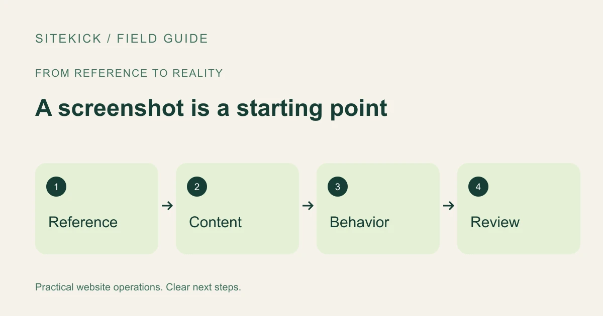
A screenshot can communicate a visual idea faster than a long description. It can show the spacing you like, how a heading and image work together, or the order of sections on a page. It is a useful brief, but it cannot specify everything a working website needs.
Before handing a screenshot to a designer or an AI-assisted builder, decide which parts are references and which parts must come from your own business. This guide explains how to prepare that brief; it does not announce a released Sitekick screenshot-import feature.
Try this next
See a starting point for your website.
Try a free browser preview, then decide whether to continue with SiteKick CMS. No account is needed for the preview.
Say what you want to preserve
Label the parts of the reference that matter. You might like a compact navigation bar, generous spacing around a service description or a particular relationship between text and imagery. Explain those choices in ordinary language.
Also say what should change. Supply your own business name, copy, images and brand assets. Do not ask a builder to reproduce another company's identity, protected artwork or testimonials. When you own the reference site, note that and identify any elements supplied by third parties that still require permission.
Add the behavior the picture cannot show
A screenshot shows one state at one viewport size. It cannot tell a builder what a menu does, where a button goes, how a form validates input or what a customer sees after submitting it.
Write a short behavior list beside the image. For each button, provide the destination or action. For forms, list the necessary fields, where inquiries should arrive and the confirmation message. Include a mobile reference if you have one; otherwise describe which information should remain most prominent on a smaller screen.
Do not include passwords, private customer details or confidential screens. Crop or redact information that is not necessary to explain the design.
Ask for editable structure
A useful implementation should let you maintain headings, text, images and links as separate elements. A flattened image of a page may look similar while being difficult to edit or navigate. Ask how the result will fit the editing workflow you intend to use.
For a WordPress project, that means agreeing on the editor and the theme or template structure before treating the draft as finished. Check whether an unfamiliar visual effect depends on extra plugins or custom code you will need to maintain.
Compare the result in two passes
First compare the visual hierarchy: section order, spacing, typography, image crops and emphasis. Decide whether the result captures the purpose of the reference rather than chasing identical pixels at one screen size.
Then test the website itself. Follow the navigation, submit a test inquiry and check the confirmation. Try a keyboard, a narrow screen and longer text. Review headings, labels and alternative text. W3C's Easy Checks offer a useful starting point, but do not replace a complete accessibility evaluation.
Record the changes you want as specific observations: which section, what differs and what should happen instead. Small, reviewable revisions are easier to judge than asking for the entire page to be regenerated without a clear reason.
Learn about Sitekick CMS and choose a workflow based on what is available now. A reviewed screenshot brief remains useful whether you implement the design manually or with an AI-assisted tool.